Project Overview: Mycos
Mycos Mushrooms
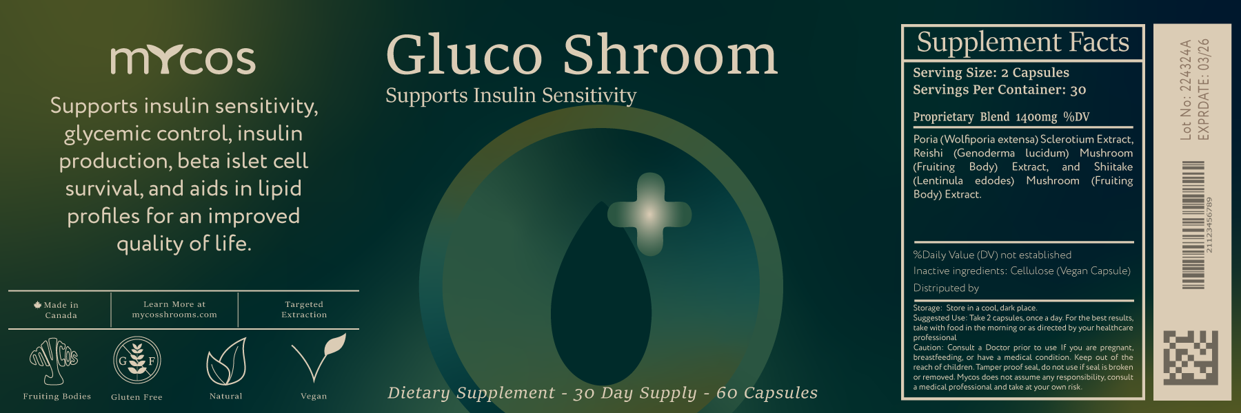
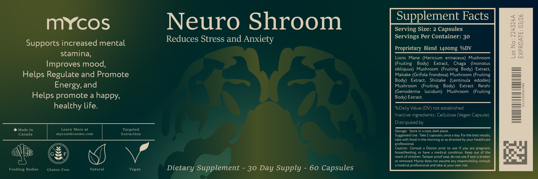
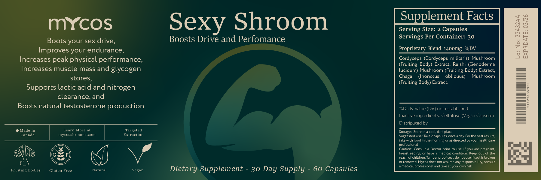
The branding and packaging for Mycos was driven by a dual mission: to establish a sense of modern, scientific reliability while ensuring the product remains approachable for all consumers. We developed a visual identity that balances cutting-edge innovation with a warm, organic feel, reflecting the natural power of medicinal mushrooms. At the heart of this project was a commitment to functional accessibility; we meticulously designed the labeling system to be highly legible and easy to navigate, utilizing clear typographic hierarchies and high-contrast elements. The result is a cohesive brand experience that feels as trustworthy as it does visionary, proving that sophisticated design and inclusive usability can work in perfect harmony.
Trust by Design: The Mycos Journey
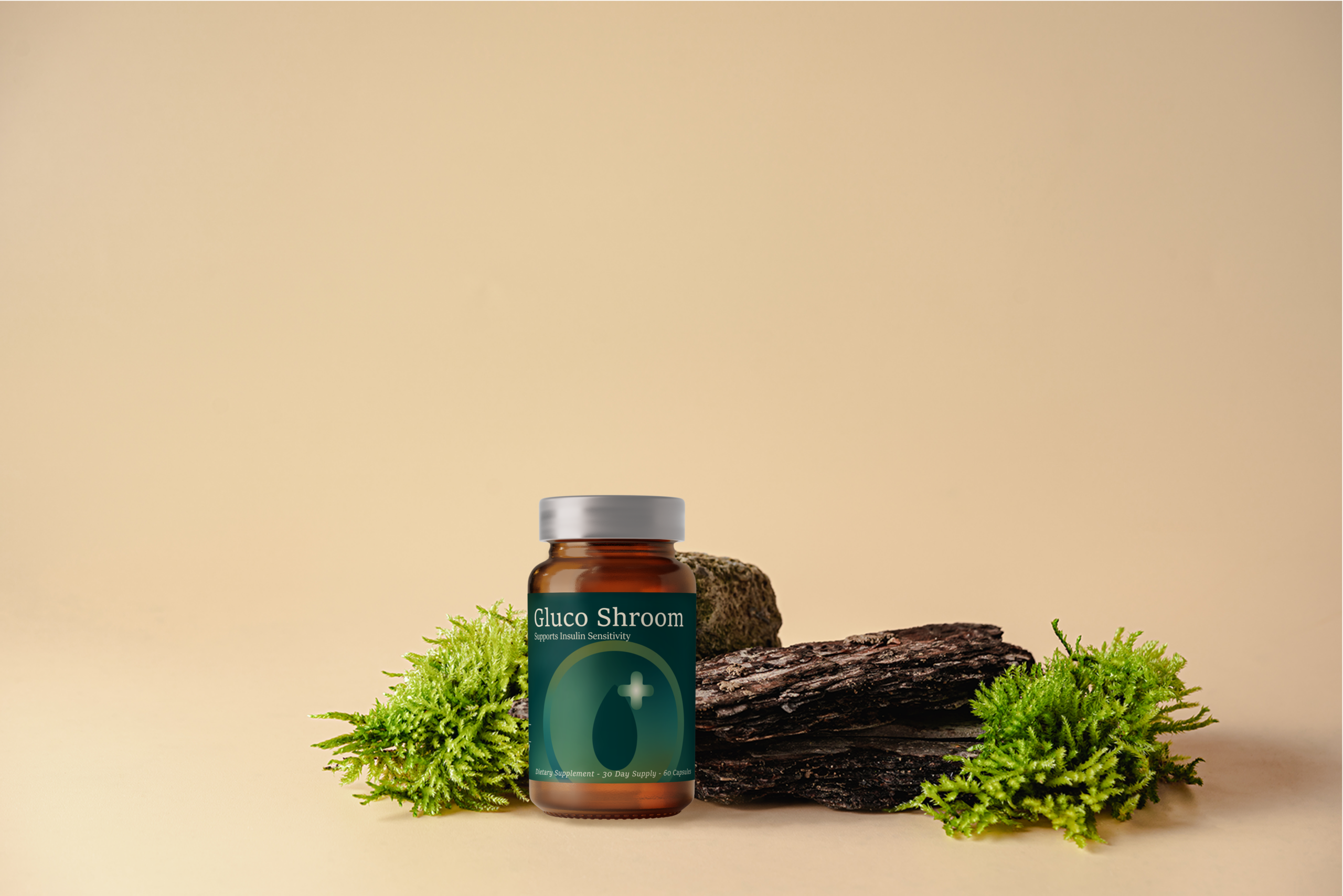
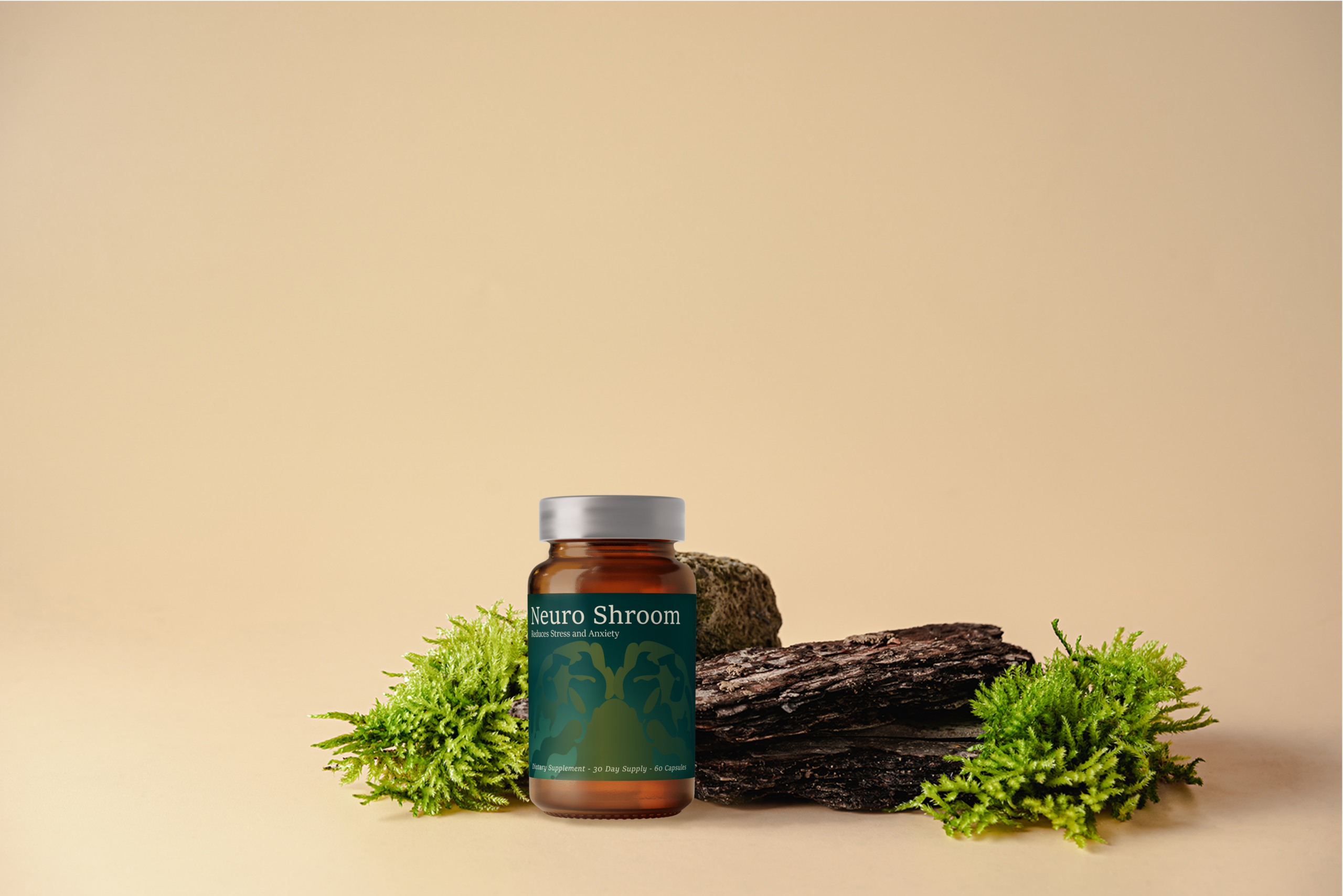
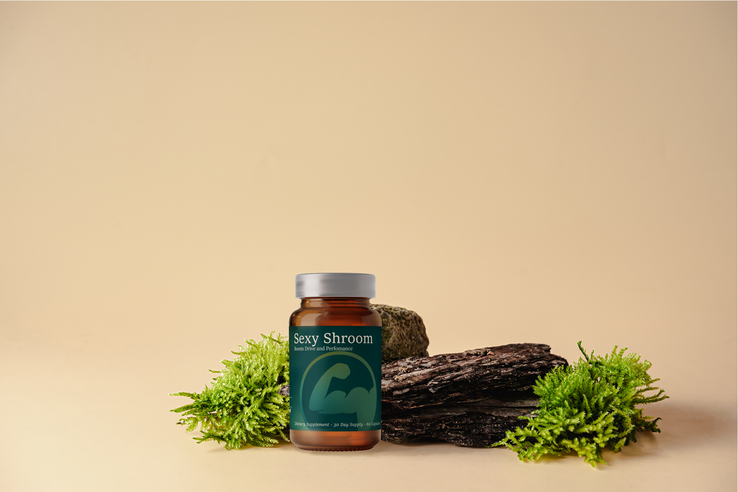
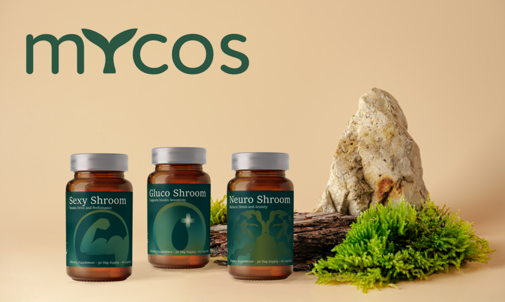
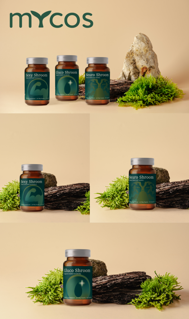
The Mycos packaging design prioritizes accessibility by bridging the gap between sophisticated aesthetics and functional clarity. We utilized a high-contrast typographic hierarchy, pairing an authoritative serif for product titles with a clean, modern sans-serif for technical data to ensure maximum legibility against the deep forest-green backdrop. To reduce cognitive load, we integrated a custom suite of minimalist icons and large, intuitive visual motifs—like the brain and muscle silhouettes—that act as a “visual shorthand” for the product’s benefits. By organizing the dense Supplement Facts into a structured, spacious grid with generous line heights, we ensured that critical health information is easily navigable for all users, proving that inclusive design can enhance a premium brand experience.