Project Overview: The Wonder Nook
The Wonder Nook
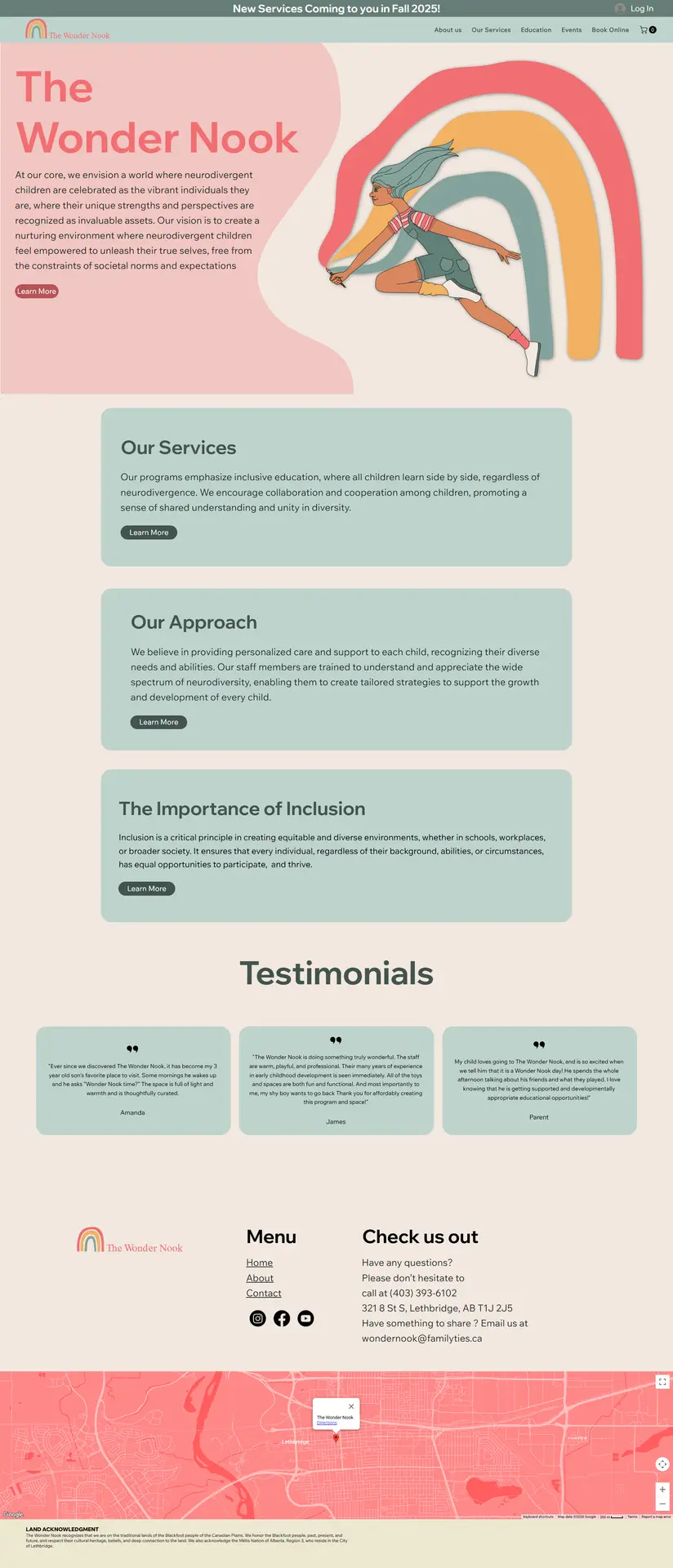
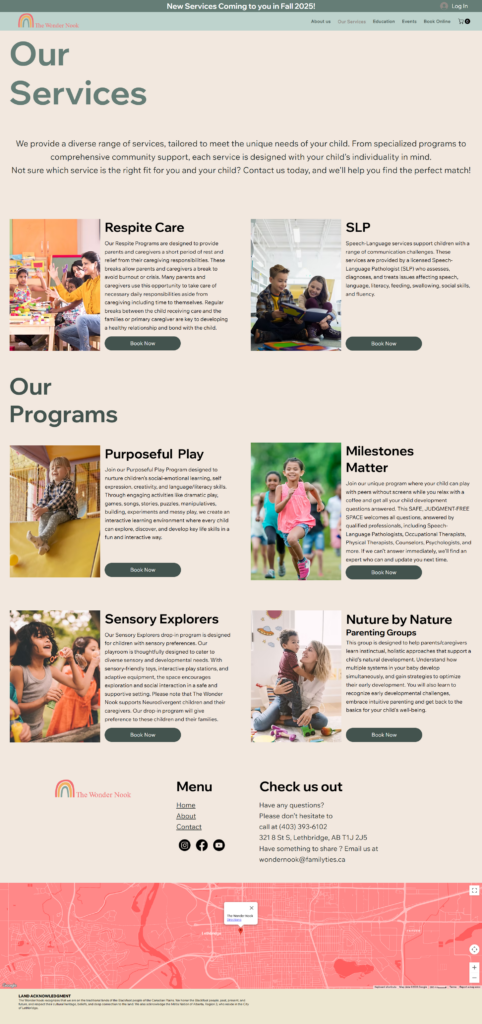
we designed a digital experience that prioritizes “visual quiet” to support families often navigating high levels of stress and sensory burnout. Understanding that our audience is frequently overwhelmed, we intentionally utilized a simplified, linear layout to reduce cognitive load and provide a predictable user journey. By replacing harsh contrasts with a warm, muted color palette and organizing complex service information into clearly defined, digestible “cards,” we removed the friction of information gathering. This intentional structure ensures that parents and caregivers can find respite care, education, and community resources without the burden of navigation fatigue, making the website a true extension of the supportive, accessible environment The Wonder Nook provides in person.
Designing for Low Cognitive Load.
The Strategy: Designing for Low Cognitive Load
Our primary goal was to create a sense of predictability and calm. For a family in crisis or a parent navigating a new diagnosis, every extra click or complex animation is a barrier to care.
Predictable Layout: We utilized a consistent, vertical grid system. By keeping the navigation and section headers repetitive and clear, we ensured that users always know where they are and what to expect next.
Visual Gentleness: We moved away from high-contrast whites and harsh blacks. Instead, we used a warm, cream-based background and a “muted rainbow” palette. This reduces eye strain and creates a welcoming, non-clinical atmosphere.
Information Chunking: Rather than dense walls of text, we utilized “cards” for services like Respite Care and SLP. This allows users to scan and digest information in bite-sized pieces, making the decision-making process feel manageable rather than daunting.